
Your subscription platform is lying to you
“Active” does not mean “paid”. Why your subscription dashboard flatters you, and the only metric that is not lying.

Not maliciously. But the number it shows you first - the big, feel-good one - is engineered to keep YOU as a brand subscribed. Not to tell you the truth.
Open Recharge (or any of the other subscription platforms) and open the cohort view.
"92% subscriber retention." "10,000 active subscribers."
Beautiful. You screenshot it. You drop it in the board deck. You sleep well :)
BUT none of those numbers mean what you think they mean.
"Active" does not mean "paid"
Read that twice, because it's the whole game: a subscriber counts as "active" as long as they haven't hit cancel. That's the entire bar.
They might have paused their subscription or repeatedly skipped orders. They could be someone who forgot they were ever subscribed in the first place. Every one of those people is still "active" on your dashboard. Every one of them is padding your retention rate.
And a scary number of them haven't sent you a single dollar in months.
Here's the framing that's stuck with me: a headline like "95% month-one retention" does not mean 95% of people paid you again. It means 95% of people haven't cancelled YET. Those are two very different sentences. One is a bank statement, the other is a pure hope.
Why the platform leads with the flattering number
Because it has its own retention to worry about.
If the first thing you see every morning is "your customers love you and they're all still here," then you love the platform, you renew, everyone's happy. Your subscription tool is a payment processor. It is very good at moving money, and very good at making the movement of money look impressive. It is not your CFO. Those are not the same job.
The three ways "active" quietly lies to you
1. Accidental renewals.
People who never realised they were on a subscription, got charged, and are now annoyed. Some cancel, ome chargeback and some demand a refund. For one glorious reporting cycle they inflated your retention and then left in a worse mood than they arrived. Any "strategy" built on making customers forget they're subscribed is just manufacturing churn on a delay + ruining the reputation of your brand on Trustpilot. You're not building loyalty at all, you're doing the quite opposite.
2. Silent cancellations.
Skip, pause and change the order date. Repeat. I've now seen enough data to say it plainly: serial-skippers and chronic-pausers are not "flexible, loyal customers." They are churn on a countdown timer. Their real lifetime value is a fraction of what the dashboard implies. All that flexibility you added to be nice? It's bleeding you quietly, and it's invisible on the headline metric.
The only metric that isn't lying to you
Money paid. Full stop.
Did the customer pay you on order one, and then pay you again on order two? Then I care about them. Are they "active" only because they paused and skipped their way out of ever paying you again? Then I don't and neither should your reporting.
Everything worth optimizing lives here:
- Repurchase rate - measured on real orders, not on "active" flags.
- net LTV:nCAC — Because you are not in the subscription business. You are in the LTV business. Retention is just the proxy.
That last line reframes the whole thing. You can make retention look incredible on command. Drop a free product, charge only shipping, and watch a dead cohort spike to "90% repurchase." Screenshot it, post it, collect the likes. It means nothing. Which is exactly why you should treat every retention screenshot on these platforms (including your own) with a healthy dose of suspicion.
So what do you actually do?
Start with your order data. For most of us that's Shopify, and there's a reason it's the source of truth: it's real, it's order-based, and unlike platform dashboards that only ever tick upward - it shows you the actual % of people who paid you money. A cohort from last April is a closed book. Those people either paid again or they didn't. No dashboard framing changes that fact.
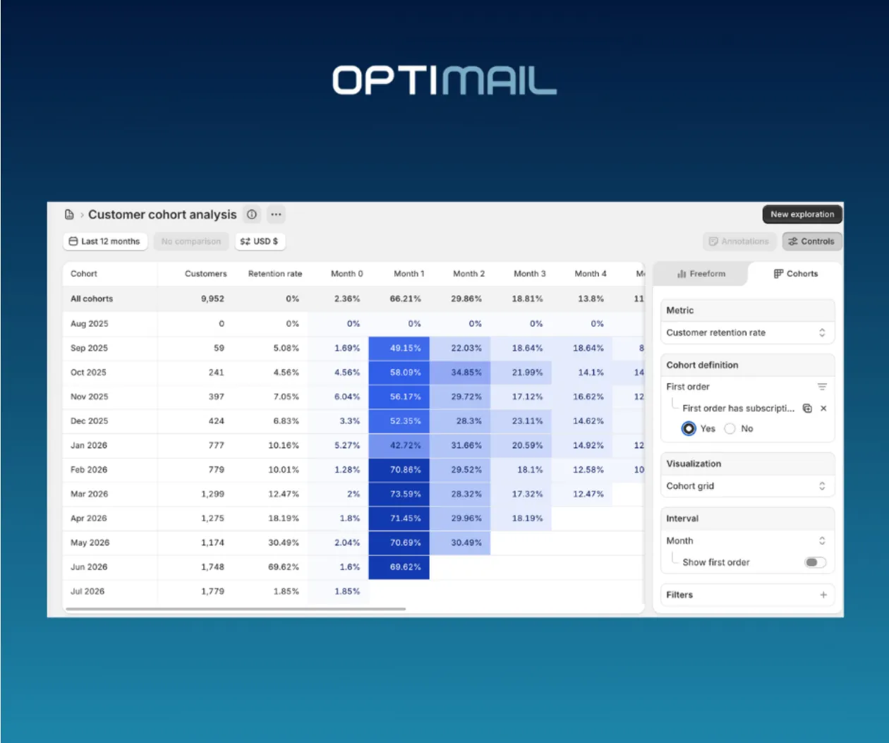
Go to Shopify -> Customer cohort analysis -> Cutomer retention rate -> First order has subscription
Then:
- Measure repurchase and retention in real dollars, month by month. Not "still subscribed." Paid.
- Audit your hidden churn. Pull the skip, pause, and pushed-date histories and see how many skips eventually turn into cancels. That's your true at-risk pool - and it's completely invisible on the headline number.
- Stop celebrating save rate in a vacuum. A cancellation you "saved" by handing someone a skip is not a save if that customer never pays you again. Look at what saved customers did next.
- Triangulate. Order data, billed events, cancellation reasons, support tickets, reviews. One number never tells the story
The reframe
Your platform will keep showing you how many people are still subscribed. That was always the wrong question.
The right one (the only one that ever shows up in your bank account) is simple and far less comfortable:
What % of those people actually paid me again and in what timeframe?
Ask that one instead. Your dashboard won't like it.
Your P&L will.